Applying hypothesis testing and confidence intervals to assess the 2016 EU referendum polling results

In the last blog post, I discussed how polls do not account for variations that arise when sample results are extended to the population. I proposed that hypothesis testing and confidence intervals should be used in polls to enable stakeholders and the general public to assess the decisiveness of the results. While hypothesis testing gives a clear-cut answer on whether a poll can conclusively favour one side over the other, confidence intervals reveal the possibilities that might arise from a poll.

In this blog post, I used hypothesis testing and confidence intervals to analyse results from EU referendum polls in 2016. Using these techniques, I drew some interesting insights identifying polls that show a significant result and evaluated the usefulness of telephone polls compared to online ones.

Methodology

I collected a list of online and telephone British polls in 2016 from Wikipedia that surveyed people on how they would respond to the EU referendum question “Should the United Kingdom remain a member of the European Union or leave the European Union?”. I only included polls that had the raw numbers (not proportions) of people that would vote Remain or Leave in the referendum. These were required for calculating the proportion of the sample voting Remain or Leave to a high level of precision (to two decimal places) and to calculate the sample size (the total number of voters participating in the poll) which are used to calculate confidence intervals and p-values (see my previous blog post for more details). I collected weighted values from these polls as they make adjustments to create a nationally-represented sample of the UK.

From these polls, I excluded voters who were undecided or would refuse to vote for two reasons. Firstly, this reduces the number of possibilities to two (Remain or Leave) which enabled me to apply hypothesis testing and confidence intervals to a specific mutually-exclusive side. Secondly, on the day of the referendum, the count excludes anyone who is undecided or refused to vote when deciding whether the UK should Remain or Leave the EU. This can be simulated by excluding the number of voters who are undecided or refuse to vote. I then calculated p-values and confidence intervals of each poll according to the formulae from the last blog post.

Comparing statistical significance via z-values and confidence intervals

## Observations: 93
## Variables: 15
## $ poll_start <date> 2016-01-08, 2016-01-08, 2016-01-15, 2016-01-15, 20...
## $ poll_end   <date> 2016-01-10, 2016-01-14, 2016-01-16, 2016-01-17, 20...
## $ pollster   <chr> "ICM", "Panelbase", "Survation", "ICM", "ORB", "Com...
## $ poll_type  <chr> "Online", "Online", "Online", "Online", "Online", "...
## $ num_remain <dbl> 901, 704, 368, 857, 1050, 544, 821, 289, 589, 664, ...
## $ num_leave  <dbl> 778, 757, 392, 815, 965, 362, 826, 186, 569, 724, 7...
## $ total      <dbl> 1679, 1461, 760, 1672, 2015, 906, 1647, 475, 1158, ...
## $ prop_leave <dbl> 0.4633711, 0.5181383, 0.5157895, 0.4874402, 0.47890...
## $ z_value    <dbl> -3.00178625, 1.38659861, 0.87057150, -1.02714357, -...
## $ p_value    <dbl> 2.684006e-03, 1.655642e-01, 3.839882e-01, 3.043529e...
## $ z_sig      <chr> "Yes", "No", "No", "No", "Maybe", "Yes", "No", "Yes...
## $ error      <dbl> 0.02385241, 0.02562212, 0.03553061, 0.02395912, 0.0...
## $ low_ci     <dbl> 0.4395186, 0.4925161, 0.4802589, 0.4634811, 0.45709...
## $ high_ci    <dbl> 0.4872235, 0.5437604, 0.5513201, 0.5113993, 0.50072...
## $ ci_sig     <chr> "Yes", "No", "No", "No", "No", "Yes", "No", "Yes", ...

In total, 93 telephone and online polls were included in the analysis. Statistical significance can be determined by both the z-value which measures the deviation of the proportion of Leave voters from the null value of 50% (representing equal numbers of Remain and Leave voters) or via confidence intervals which depicts statistical significance by the confidence interval not crossing the 50% proportion threshold. I initially compared z-values and confidence intervals to see whether both techniques can similarly detect statistical significance at the p < 0.05 level.

##        
##         No Yes
##   Maybe  4   1
##   No    54   0
##   Yes    0  34

The rows and columns in the table represent statistical significance detected by z-values and confidence intervals respectively. Overall, both techniques can identically delineate statistically significant and non-significant polls. I also included a “maybe” category for z-value hypothesis testing representing polls of borderline statistical significance (i.e., p-values between 0.05 and 0.10). Of these polls, four of them had a non-significant result as derived from confidence intervals.

We can visualise the comparison of statistical significance from z-values and confidence intervals:

In general, polls that are statistically significant via z-values have confidence intervals that do not cross over the 50% threshold. In contrast, polls that are not statistically significant via z-values have confidence intervals that cross over the 50% threshold. Polls that are borderline statistically significant (represented by orange) had one end of the confidence interval “touching” or slightly crossing over the 50% threshold. This visualisation shows the ability of statistical techniques to distinguish polls that decisively favour one side from those that show a balance of votes between the two sides.

##        
##           No  Yes
##   Maybe 0.04 0.01
##   No    0.58 0.00
##   Yes   0.00 0.37

Most polls (58%) are not statistically significant with the proportion of Leave voters not deviating significantly from the 50% null value. These results suggest that these polls cannot decisively favour Leave over Remain and vice-versa. The remaining polls have a Leave result that is significantly (37%) or borderline (5%) different from the 50% null value.

Overall, these results underline that statistical significance derived from z-values and confidence intervals are equivalent to each other. Therefore, in subsequent analyses, I used statistical significance derived from z-values to investigate polling results further.

How can statistical significance assist in interpretability of polls?

I firstly counted the number of statistically significant and non-significant results from online and telephone polls.

From the graph, most non-statistically significant results come from online polls while most statistically significant results are derived from telephone polls. Identifying an interesting result, I investigated further at the characteristics of online and telephone polls in EU referendum polls.

Surprisingly, all telephone polls that had a statistically significant result favoured Remain as indicated by the lower than 50% proportion of Leave voters. They also had relatively small sample sizes, surveying less than 1,000 people. In contrast, most online polls, which survey more than 1,000 people, do not show a statistically significant result, describing a 50:50 split between Remain and Leave. Of the handful of online polls that are statistically significant, the number of online polls that favoured Leave (indicated by >50% Leave voters) is double that of those favouring Remain.

I also investigated the margins of error between online and telephone polls. Telephone polls had higher margins of error (median = 3.5%) compared to online polls (median = 2.4%) due to the smaller sample sizes. Given that the 2016 EU referendum favoured Leave over Remain, these results suggest that while online polls are more likely to be robust as they survey a larger sample size, telephone polls are more likely to declare a decisive result but are more prone to favour the wrong side. This might be one of the myriad of contributing factors why phone polls are more likely to get the EU referendum result wrong compared to online polls.

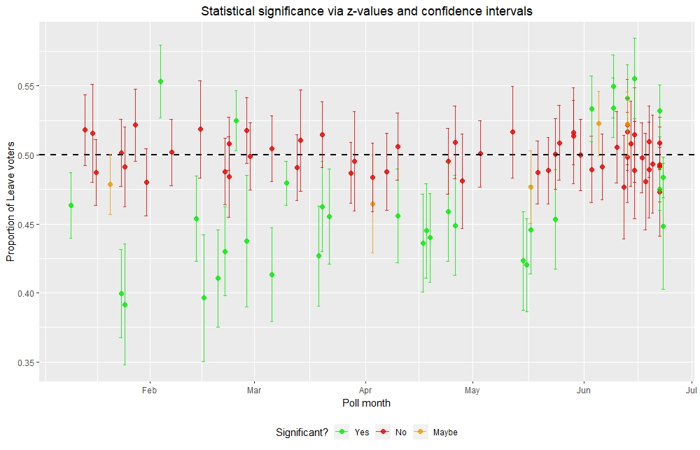
How do EU referendum polls track overtime?

I next looked at the polling results overtime and how they are affected by statistical significance, taking into consideration the poll type and sample size.

Most polls are not statistically significant, straddling along the 50% threshold. These polls suggest a 50:50 split between Remain and Leave voters, not favouring one side over the other. Of the polls that showed statistical significance, up until June nearly all of them are telephone polls that favoured Remain (indicated by lower than 50% Leave voters). There were only four online polls that showed statistically significant results with two favouring Remain and the other two favouring Leave. However, from June onwards, nearly all statistically significant results came from online polls. Most of them favoured Leave up until just before the referendum where the last two statistically significant online polls favoured Remain.

These online polls were different from the referendum result which favoured Leave over Remain. This is because there are other sources of error such as voter turnout that are not accounted for in the statistical techniques used. Nevertheless, hypothesis testing is a very powerful tool for limiting polls that show a decisive result from those that do not. This gives us a subset of the data from which insightful conclusions can be made.

Conclusion

Hypothesis testing is very useful for selecting polls that show a significant deviation from a 50:50 split between Remain and Leave voters. Combined with confidence intervals, these statistical techniques have unveiled some interesting results. For instance, while telephone polls are more likely to declare a decisive result, they are also more prone to favour the wrong side as can be seen in the 2016 EU referendum. In contrast, online polls are less likely to declare a decisive result but are more likely to favour the correct side due to surveying more people. It is why nearly all Brexit polls after the 2016 EU referendum are conducted online rathern than by phone.

In summary, the use of hypothesis testing and confidence intervals will serve to better clarify the usefulness of polls and whether they show a decisive result on a particular issue and what range of possibilities are available. Given the explosion of data and information in the modern age, it is more important than ever that people are equipped with the tools to interpret and assess the legitimacy and accuracy of facts. Teaching people how to use and interpret hypothesis tests and confidence intervals will serve them well for not only deciding whether they should care about a poll but also for assessing and debating findings from different sources of information.

Appreciating statistical variation to improve the interpretability of polls

The 2016 European Union (EU) referendum produced one of the biggest surprises of the 21st century. Most polls leading up to the referendum suggested that the majority of UK would vote Remain in the EU. However, the referendum produced a different result with 51.9% voters wanting to Leave the EU. Since then, there have been chaotic scenes on whether and how Brexit would be enforced. The polling industry has also been under attack with debate surrounding whether polls are still useful for predicting how the population would vote on important issues such as Brexit.

The conflict between Remaining and Leaving the EU still rages on in the UK. Source

What the mass media and the general public do not appreciate is that polls, whose results are taken as the overall view of the population, only survey one small part of a population that might vote differently from the sample. This introduces variation in the polling result which might introduce a situation where it does not favour one side over the other. Hypothesis testing and confidence intervals can be used to decide whether the public should care about a polling result and the range of referendum results that are possible from a poll. If communicated simply to politicians and the public, more informed decisions can be made on what, if any, one should do to influence people’s views towards voting Remain or Leave in the EU referendum.

How do opinion polls report variation in results?

Opinion polls are conducted on people drawn randomly from a population to gauge the population’s views of an issue. It is like tasting a small sample of a meal such as soup and using our thoughts of the sample to make a general judgement of the meal. In our case, we use statistics to extend the results of the sample to make conclusions about a population. The problem of this method is that people outside the sample may vote differently from those in it, causing population results to differ from a poll.

Hence, in statistics, it is important to account for the variation in polling results to capture the true value of the population. This is encapsulated by the margin of error which is added or subtracted from the sample value obtained in a poll. Mathematically, this can be defined as:

Population value = sample value ± margin of error (± means add or subtract)

In the case of an EU referendum poll, the sample value would be the proportion of the sample that vote Remain or Leave while the margin of error provides the space to capture the proportion of the population that would vote Remain or Leave. This margin of error is set to 3% in most polls which is not reported by mass media. Hence, readers might erroneously assume that the polling results represent the true proportions of the population voting in a particular way. Although the margin of error is an essential tool to account for variations of the population value from a poll, it is insufficient as readers cannot comprehend the different outcomes that might be generated. This can be resolved by using confidence intervals.

A better tool for reporting variation in results: confidence intervals!

We can subtract or add the margin of error from the sample value to produce the lower and upper bounds of a population value respectively. Combining these bounds produces confidence intervals, the range of values that we are almost certain captures the true population value. Although they can be produced at varying levels of confidence, they are usually set at 95% confidence to almost guarantee (at 95% confidence) that what we conclude from a poll can be generalised to the whole population. This makes it very useful for thinking about the different outcomes of the EU referendum that might be generated from conducting a poll.

Calculating the confidence interval of a polling result

1. Find the sample value of a poll. In our case, we want to calculate the proportion of the sample that vote Leave. This can be calculated as:

prop_{Leave} = \frac{Total(Leave)}{Total(voters)}

2. Calculate the margin of error (MOE) to measure variation in the poll results. In our case, to calculate the MOE for our 95% confidence interval, we use the formula:

MOE_{Leave} = 1.96 \times \sqrt{\frac{prop_{Leave} \times (1 - prop_{Leave})}{Total(voters)}}

The MOE is influenced by the sample size which describes the total number of people that have voted (Total(voters)) in the poll.

3. Subtract or add the MOE from the sample value to get the lower and upper bounds of the confidence interval respectively.

Lower bound = sample value – margin of error

Upper bound = sample value + margin of error

4. Combine the lower and upper bound values to generate the 95% confidence interval. This describes the range of values that we are 95% sure captures the true population value (in our case, the proportion of the population that vote Leave).  

Confidence interval = (lower bound, upper bound)

The basics of hypothesis testing

Although confidence intervals can describe the different outcomes of the EU referendum, it does not give a clear-cut answer of whether we should care about a poll. This is where hypothesis testing comes in.

In hypothesis testing, we assess assumptions of a population value against data of a random sample. It is analogous to a criminal trial, where a criminal is presumed innocent until enough evidence is collected to prove guilt. In the same sense, we assume that the null (H0) hypothesis is true until proven otherwise. The null hypothesis proposes that there is no deviation from a set population value in response to some event. This arises when we produce a polling result that would have most likely appeared by chance. Conversely, if we have a polling result that is so rare and unusual that it would not have arisen by chance, then we have enough evidence to reject the null hypothesis and accept the alternative (Ha) hypothesis. The alternative hypothesis describes a deviation of the population value from some set value.

In our case, we want to assess whether a poll can decisively conclude that most of the population would vote Remain or Leave. We write our two hypotheses as follows (prop0,Leave is the proportion of the population that would vote Leave from the null hypothesis):

H0: there is an even split of Remain and Leave voters in the poll.  prop0,Leave = 0.5

Ha: the poll decisively favours Remain or Leave. prop0,Leave ≠ 0.5

Should we care about a polling result? Let’s use a hypothesis test to find out!

There are many statistical tests that can be used depending on the kind of data that we are analysing. As we are analysing the proportion of people that vote Remain or Leave in a poll, we convert the proportion to a standardised z-value that can be used to calculate probabilities on a normal z-distribution (better known as a “bell curve”).

What a normal z-distribution looks like. Source

The z-value can be calculated by the formula:

z-value = \frac{prop_{Leave} - prop_{0,Leave}}{\sqrt{\frac{prop_{0,Leave} \times (1-prop_{0,Leave})}{Total(voters)}}}

If we set prop0,Leave = 0.5 (meaning an even split of Remain and Leave voters in the population), we can simplify the z-value to:

z-value = \frac{prop_{Leave} - 0.5}{\sqrt{\frac{0.5 \times (1-0.5)}{Total(voters)}}} = 2 \times \sqrt{Total(voters)} \times (prop_{Leave}-0.5)

This z-distribution (Z) can be used to calculate the probability (the p-value) that we generate a random result that is just as or more extreme that the polling result given some set value from a null hypothesis. This is represented mathematically as:

p-value = Pr(Z \leq -z-value \hspace{2mm} OR \hspace{2mm} Z \geq +z-value)

And can be calculated using normal tables, a calculator or a computer. We compare the p-value to an alpha value which is the threshold that the p-value has to go below to reject the null hypothesis. Although we can set different alpha-values between 0 and 1, it is usually set to 0.05 (which describes a 5% chance that we get a random result that is just as or more extreme than the polling result given some null value).

  • If the p-value is more than the alpha value (i.e., p > 0.05), then we have failed to reject the null hypothesis. We conclude that the poll cannot decide whether most of the population would vote Remain or Leave in the EU referendum.
  • If the p-value falls below the alpha value (i.e., p < 0.05), then we reject the null hypothesis and accept the alternative hypothesis. We conclude that the poll can decisively favour Remain or Leave in the EU referendum among the population.

Hypothesis testing is useful for deciding whether the public and stakeholders should care about a polling result, facilitating informed decisions on how campaigning needs to be done.

Applying hypothesis testing and confidence intervals to a real-life EU referendum poll

Let’s look at an online poll run from 27th to 29th May 2016 by the polling company ICM. Out of 1753 people, 848 (48.37%) voted Remain and 905 (51.63%) voted Leave. Should we care about the ICM poll?

First, let’s use hypothesis testing to decide whether the ICM poll is decisive. We declare two hypotheses:

H0: There is an even split of Remain and Leave voters in the population. prop0,Leave = 0.5

Ha: There are more Remain voters in the population than Leave voters. prop0,Leave ≠ 0.5

Since we have propLeave = 0.5163 (converted from percentage to decimal), we calculate the z-value as follows:

z-value = \frac{0.5163 - 0.5}{\sqrt{\frac{0.5 \times (1-0.5)}{1753}}} = 1.3614

And calculate its p-value:

p-value = Pr(Z \leq -1.3614 \hspace{2mm} OR \hspace{2mm} Z \geq +1.3614) = 0.1738

The p-value of 0.1738 exceeds the alpha-value of 0.05, so we failed to reject the null hypothesis. The ICM poll cannot decisively favour Remain or Leave, implying an even split of two sides among voters in the population.

How can we visualise the indecisiveness of this poll? We can use confidence intervals to do this.

First, calculate the margin of error (MOE). The MOE will be the same regardless of whether the proportions of Remain or Leave voters are used.

MOE_{Leave} = 1.96 \times \sqrt{\frac{0.5163 \times (1-0.5163)}{1753}} = 2.34\%

This is within the 3% MOE mentioned in most polls.

We use the MOE to calculate the confidence intervals of Leave and Remain voters.

Leave confidence interval = 51.63 ± 2.34% = (49.29%, 53.97%). This confidence interval states that we are 95% sure that the true proportion of the population that would vote Leave is between 49.29% and 53.97%.

Remain confidence interval = 48.37 ± 2.34% = (46.03%, 50.71%). This confidence interval states that we are 95% sure that the true proportion of the population that would vote Remain is between 46.03% and 50.71%.

These confidence intervals appreciate that the proportion of the population voting Remain or Leave might differ from the polling results. The real power of confidence intervals; though, comes when we visualise them in a number line.

The number lines above show the ICM poll results (indicated by the middle point of the line) along with the Leave and Remain confidence intervals. Two things can be observed from the number line:

  1. A 50:50 split between Leave and Remain voters is possible in an EU referendum (indicated by a dashed line) because the confidence intervals of both the Leave and Remain sides contain the 50% proportion. This result would not provide a clear indication of which side would win, something the mass media does not appreciate when hyping up a particular result.
  2. A referendum involving the population might produce a different result from a poll. Although the poll had a higher proportion of Leave than Remain voters in the sample, it is possible that in a referendum over the population, there might be more Remain than Leave voters. Hence, the poll cannot conclusively favour one side over the other.

These two points open the possibility that the poll might not capture the views of the population. This is something the reader overlooks not only because the mass media excludes the margin of error but because they do not realise that the polling results may not reflect the views of the whole population. If the confidence intervals of two groups in a sample overlap each other, it is possible that the referendum results of a population might be very different from the polling results of a sample.

Conclusion

How polling results are reported by the mass media today covers up the dangers of extending results from a sample to infer conclusions about a population. Even citing the margin of error does not paint a true picture of the range of possibilities that might arise from a poll. In contrast, hypothesis testing and confidence intervals can produce a lot of insights of how we interpret polls. While hypothesis testing can tell us whether we should care about a polling result, confidence intervals can reveal the variability produced when polling results are extended to the overall population.

Ideally, the mass media would adopt hypothesis testing and confidence intervals as tools to correctly interpret polls and to responsibly extend results to the population. Given the mass media’s interest in hyping up polling results regardless of whether they are warranted or not, this is most likely not possible. Hence, independent companies should be set up to analyse polling results and to provide a truthful interpretation of the polls to the public so that they can decide whether they should act on a poll or not. Keeping the polling industry accountable to these statistical measures will ensure the viability of polls in painting a truthful picture of how the population thinks on various issues of the country.

What are the themes and sentiments of Poppin’Party’s and SILENT SIREN’s songs? A look into the bands of the “NO GIRL NO CRY” band battle

Poppin’Party and SILENT SIREN are two all-female Japanese bands that play similar styles of music. Poppin’Party is one of the bands that is part of the BanG Dream! franchise established by Bushiroad. Spanning multiple forms of media, the band consists of anime characters whose voice actresses also perform their own instruments in live shows. SILENT SIREN was established in 2010 by a group of amateur female models. They have released many albums and have also performed in various live shows.

The participants of the “NO GIRL NO CRY” band battle. Left is Poppin’Party and right is SILENT SIREN. Source: https://bandori.fandom.com/wiki/File:NGNC_Main_Visual.jpg

These two bands will perform in the band battle event “NO GIRL NO CRY” in Japan on May 18th and 19th. In celebration of this event, I looked at the lyrics of Poppin’Party’s and SILENT SIREN’s songs to identify the themes and sentiments between the two bands. This was done using a methodology established in my last blog post. Additional analyses were also conducted to glean more insights from the songs of both bands.

Exploratory Data Analysis of lyrics

## # A tibble: 2 x 3
##   band         num_songs num_words
##   <chr>            <int>     <dbl>
## 1 Poppin'Party        30      3255
## 2 Silent Siren        38      3659

SILENT SIREN released many songs over their nearly ten years of existence. Luckily, I was able to find enough English translations of their songs to match the number of English translations of Poppin’Party songs. This enabled comparable text and sentiment analyses to be conducted between the two bands.

Both bands had a word that appeared two to three times more frequently in the lyrics compared to other words. For Poppin’Party, that word was “dream” which appeared two times more frequently than other words. For SILENT SIREN’S, the word “love” appeared three times more frequently than other words. These observations may underline the predominant themes of each band’s songs which will be explained later in the blog post.

Commonality cloud: which words are common across both bands’ lyrics?

A commonality cloud visualises the frequency of words that appear in the lyrics of both bands. The size of each word in a commonality cloud is based on how frequently the word appears in both groups of lyrics. Note that a word that appears very frequently in both groups of songs will be bigger in the commonality cloud than a word that appears frequently in one group of songs but not the other.

According to the commonality cloud, both Poppin’Party’s and SILENT SIREN’s songs have words that were associated with feelings and experiences. In particular, love was a common word found in the lyrics of both bands’ songs. Other words relating to experiences that appeared in both groups of songs included “time”, “world” and “summer”.

Comparison cloud: which words are more frequent in one band’s songs over the other?

In contrast to a commonality cloud, a comparison cloud plots words based on whether the word appears more frequently in the lyrics of a band’s songs compared to the other. A difference is taken between the word frequencies of both groups of lyrics. Following this, the word is plotted to one side of the comparison cloud and the size is varied based on the magnitude of the difference. A comparison cloud allows us to identify words and potential themes that are prevalent in a band’s songs over another group of songs.

From the comparison cloud, “dream” appeared more frequently in Poppin’Party’s songs compared to SILENT SIREN’s songs. Also in Poppin’Party’s side of the comparison cloud are words that are related to experiences and the future such as “song”, “future” and “tomorrow”. The appearance of these words in the comparison cloud indicates that Poppin’Party’s songs tend to touch on achieving goals for the future and creating experiences while doing so.

In contrast, SILENT SIREN’s songs tend to touch on romance. “Love” is a word that appeared frequently in SILENT SIREN’s songs, moreso than Poppin’Party’s songs. In SILENT SIREN’s side are words that are also associated with romance such as “sweet”, “darling” and “kiss”. The appearance of these words in SILENT SIREN’s songs indicates that their songs tend to deal with love and romance and how people react to them.

Bing sentiment analysis of the bands’ songs

I conducted a “bing” sentiment analysis of the songs to measure the proportion of positive and negative words of each band’s lyrics. Overall, Poppin’Party’s songs had a higher proportion of positive-associated words compared to SILENT SIREN’s songs.

Half of the negative- and positive-associated words are similar across Poppin’Party’s and SILENT SIREN’s songs. For Poppin’Party’s songs, most of the negative-associated words are linked to sensations relating to negative emotions such as “throb”, “shake” and “painful”. They also have positive-associated words that describe a person’s internal strengths such as “courage”, “strong” and “gentle”. SILENT SIREN’s songs tend to have negative-associated words linked to loneliness such as “cry”, “lonely” and “ambiguous”. They also have positive-associated words that describe sensations such as “happy”, sparkle” and “flutter”. These words might appear more frequently in SILENT SIREN’s songs due to their focus on romance.

NRC sentiment analysis of the bands’ songs

I conducted an NRC sentiment analysis to measure the proportion of words belonging to specific emotions. The proportion of words in six of the eight emotions are similar between the two bands. However, SILENT SIREN’s songs had a lower proportion of words associated with anticipation and a higher proportion of words belonging to fear compared to Poppin’Party’s songs.

Some of the most frequent words associated with each emotion such as “feeling” and “smile” were similar across both bands. There were some unique words in each band; however, that may represent the overall themes of their songs. For Poppin’Party, “sing” is a word that appears across many emotions, namely anticipation, joy, sadness and trust. These emotions can be found in some of their songs which touch on many themes, particularly the idea of playing together as a band.

In contrast, SILENT SIREN’s songs can be split into two broad areas. The words “sweet” and “kiss” can be found in many positive emotions such as anticipation, joy, surprise and trust. These words relate to the romantic theme of their songs. Another area touched on in SILENT SIREN’s songs could be the feeling of loneliness when losing friends or breaking up. This can be seen in the words “lonely” in anger and disgust, “disappear” and “escape” in fear and “leave” and “cry” in sadness.

Conclusion

Conducting text and sentiment analyses of the songs has uncovered some interesting insights about both bands. Poppin’Party’s songs tend to talk about setting and achieving future goals while creating memories and experiences. Their songs tend to be quite positive but they also touch on a variety of sensations and emotions as evidenced in their songs. On the other hand, SILENT SIREN’s songs tend to talk about romance and the various emotions elicited, both positive (in the case of joy) and negative (in the case of loneliness). It is surprising; then, that the similar music styles of both bands can cover up the different topics touched on by both bands. Based on these results, it will be interesting to see how these two bands will clash when they meet in the band battle this weekend.

Acknowledgements

I would like to acknowledge the following people who have translated the Poppin’Party and SILENT SIREN songs from Japanese to English:

  • Arislation
  • BlaZofgold
  • Eureka
  • Gessami
  • Kei
  • Kikkikokki
  • Komichi
  • LuciaHunter
  • Maki
  • ManekiKoneko
  • MijukuNine
  • Misa
  • NellieFeathers
  • Ohyododesu
  • Starlogakemi
  • Thaerin
  • Tsushimayohane
  • UnBound
  • Youraim

I may have missed other people who have translated songs for this analysis, but I thank you all the same.

A methodology of conducting sentiment analysis of Bandori lyrics

This blog post was written with the intention of describing how I conducted my sentiment analyses so that others can replicate what I did and possibly adapt it to their projects. The analysis was conducted in R using the tidyverse series of packages.

Setting up

I started by loading the following packages I needed to conduct sentiment analysis into R:

  • tidyverse, a suite of packages that makes it easy to manipulate tibbles (a type of table or dataframe) and generate graphs using the dplyr and ggplot2 packages respectively;
  • stringi as I needed the stri_isempty() function to remove empty lines;
  • corpus for the text_tokens() function to stem and complete words while cleaning the lyrics;
  • qdap and tm for cleaning lyrics and conducting initial text mining analyses;
  • tidytext to access the “bing” and “nrc” sentiment lexicons I needed to conduct sentiment analyses;
  • wordcloud2 to visualise word frequencies within Bandori songs; and
  • broom to convert the test results into a table so that parts of the test results can be easily extracted.
#Load the required packages
library(tidyverse)
library(stringi) 
library(corpus) 
library(qdap)
library(tm)
library(tidytext)
library(wordcloud2)
library(broom)

I created an empty tibble “lyricsTbl” containing four columns: “doc_id” for numerically identifying the lyrics; “text” for holding lyric data, “title” for song name and “band” for band name. This empty tibble was used to import lyrics and associated data. Note that the columns were set in this exact layout because when the corpus is created, the tibble splits in half with the last two columns being defined as metadata for the lyrics data from the first two columns.

#Create an empty tibble to import lyrics
lyricsTbl <- tibble(doc_id = numeric(), text = character(), title = character(), band = character())

Function building

I created three functions to make it easier to run all importing and cleaning steps in one go with fewer inputs.

I first built the lyric_import() function to import lyrics into the lyricsTbl tibble. This function takes a string containing the name of the lyrics document (doc) and a number (id) for the doc_id and returns a lyricsTbl tibble containing the doc_id and lyrics data as well as its associated metadata (i.e., song and band names). Note that the lyrics documents have to be set up in a specific layout so that parts of the lyrics document are correctly imported into lyricsTbl:

  • The first line contains the song and band titles, separated with a “ by ” separator.
  • The second line contains the URL to the lyrics.
  • The third line is a credits line, acknowledging the person that has translated the lyrics and the date in which the translated lyrics were first uploaded.
  • The fourth line onwards contains the lyrics.
#Build a function to import lyrics into lyricsTbl
lyric_import <- function(doc, id) {

  #Import raw lyrics document into R
  document <- readLines(doc)

  #Collect song information and lyrics from the raw lyrics document
  first_line <- document[1]
  title <- str_split(first_line, " by ")[[1]][1]
  band <- str_split(first_line, " by ")[[1]][2]
  lyrics <- document[4:length(document)]

  #Remove empty lines in lyrics
  lyrics <- lyrics[!stri_isempty(lyrics)]

  #Combine lyrics into one line
  line <- str_c(lyrics, collapse = " ")

  #Add lyrics and song information into lyricsTbl table
  lyricsTbl <- add_row(lyricsTbl, doc_id = id, text = line, title = title, band = band)

  #Return the updated lyricsTbl table
  return (lyricsTbl)
}

The second function I built is the corpus_clean() function. This function is designed to run the cleaning steps of each lyrics document so that punctuation and common stopwords (commonly-used words that do not add meaning to text analyses) are removed. This function takes a corpus of lyrics documents and a vector of additional stopwords to remove and returns a corpus where punctuation and stopwords are removed.

#Build a function containing a pipe to clean the corpus of lyrics documents
corpus_clean <- function(corpus, stopword = "") {
  #Define stopwords first to remove common and user-defined stopwords
  stopwords <- c(stopwords("en"), stopword)  

  #Build a stemmer dictionary from lexoconista.com
  stem_list <- read_tsv("C:\\D\\2015\\PhD\\data science blog\\bandori lyric analysis\\lemmatization-en.txt")
  names(stem_list) <- c("stem", "term")
  stem_list2 <- new_stemmer(stem_list$term, stem_list$stem)
  stemmer <- function (x) text_tokens(x, stemmer = stem_list2)

  #Replace all mid-dots (present in some lyrics) with an empty space. This function was defined as removePunctuation cannot remove mid-dots
  remove_mid_dot <- function (x) str_replace_all(x, "·", " ")

  #Replace original apostrophies in the lyrics with the alternative apostrophe because retaining original apostrophies prevents replace_contraction from working
  replace_apos <- function(x) str_replace_all(x, "'", "'")

  #Clean corpus through a pipe
  corpus <- corpus %>%
    tm_map(content_transformer(tolower)) %>%
    tm_map(content_transformer(remove_mid_dot)) %>% 
    tm_map(content_transformer(replace_apos)) %>%
    tm_map(content_transformer(replace_abbreviation)) %>%
    tm_map(content_transformer(replace_contraction), sent.cap = FALSE) %>%
    tm_map(content_transformer(replace_symbol)) %>%
    tm_map(content_transformer(replace_number)) %>%
    tm_map(content_transformer(stemmer)) %>% 
    tm_map(removeWords, stopwords) %>%     
    tm_map(removePunctuation) %>%      
    tm_map(stripWhitespace)

  return(corpus)
}  

Lastly, I built the word_freq() function which generates a word frequency table of each song in tidy format (with each row defining a word-song pair and each column representing a variable). This function takes a corpus of cleaned lyrics documents and returns a tidied tibble containing columns for words, song names and their frequencies.

#Create a function showing frequencies of each word in a song in tidy tibble format
word_freq <- function(corpus) {
  #Generate a Term Document Matrix (TDM) and convert it into a matrix
  tdm <- TermDocumentMatrix(corpus) 
  matrix <- as.matrix(tdm) 

  #Name columns (i.e., the songs) in the matrix
  colnames(matrix) <- meta(corpus)$title 

  #Convert matrix into a tibble and add a column containing the words
  tdm_song <- as_tibble(matrix) %>% mutate(word = rownames(matrix))

  #Swap columns so that word column is moved from the last to the first column
  tdm_song <- tdm_song[, c(ncol(tdm_song), 1:ncol(tdm_song) - 1)] 

  #Tidy the table so that all song names are placed in one column and remove any rows with 0 frequency 
  tdm_tidy <- tdm_song %>% 
    gather(key = "song", value = "freq", -word) %>%
    filter(freq != 0) 

  return(tdm_tidy)
}

Writing these three functions made it easier to generate the tables of data that were required to conduct sentiment analyses.

Importing and cleaning lyrics data

English-translated lyrics were copied from the Bandori Wikia (https://bandori.wikia.com/wiki/BanG_Dream!_Wikia) and pasted into separate .txt files in Notepad. These .txt files were then saved into one folder containing all the English-translated lyrics of Bandori original songs. From there, the lyric_import() function was used to import translated lyrics from all bands into lyricsTbl. Each lyrics document was assigned a unique doc_id according to the order in the folder.

#Import all lyrics into lyricsTbl
for (i in 1:length(dir())) {
  lyricsTbl <- lyric_import(dir()[i], i)
}

The lyricsTbl containing the lyrics was converted into a volatile corpus. In the creation of the corpus, the lyricsTbl was split into content (containing the “doc_id” and “text” columns) and metadata (containing “title” and “band” columns) tables. The lyrics were then cleaned with the corpus_clean() function. Note that no stopwords were added to the corpus_clean() function alongside the most common stopwords.

#Create a volatile corpus containing the Bandori lyrics
bandori_corpus <- VCorpus(DataframeSource(lyricsTbl))

#Clean bandori_corpus with corpus_clean() function
bandori_corpus_clean <- corpus_clean(bandori_corpus)

This is because each band had words that are overused in a small number of songs (typically one to two songs) without giving much context. Examples of such words include words that were used consecutively (e.g., “fight”), exclamations (e.g., “cha”) and sound effects (e.g., “nippa”). These words were identified for each band using the term frequency-inverse document frequency (Tf-Idf) which identifies the most frequent words spread over few documents. These words along with the band were stored in a CSV file which was loaded into R as “stopwords.”

#Load CSV file containing band-specific stopwords
stopwords <- read_csv("C:\\D\\2015\\PhD\\data science blog\\bandori lyric analysis\\compiled lyrics\\band_stopwords.csv")

A tidied word frequency table containing frequencies of all words for each song (minus common stopwords) was generated with the word_freq() function. From there, two anti-joins were conducted to remove the stopwords: the common stopwords that were not initially removed in the corpus_clean() function (under stop_words) and the band-specific stopwords (contained in stopwords). As the word frequency tibble contained the song names but not the band names, the column containing the band names was also added via an inner_join() function between the word frequency table and the meta table of the corpus.

#Create a tidied word frequency table, removing more common stopwords and band-specific stopwords.
bandori_noStop <- word_freq(bandori_corpus_clean) %>%
                  anti_join(stop_words) %>%
                  inner_join(meta(bandori_corpus), by = c("song" =                         "title")) %>%
                  anti_join(stopwords, by = c("word", "band"))

Exploratory data analysis

I initially generated a table which had counts for the number of songs and words for each band. Song counts were derived from the original lyricsTbl tibble while word counts were obtained from the bandori_noStop tibble. They were then combined into one table so that the number of songs and words were matched to their bands.

#Count the number of songs for each band
band_count <- lyricsTbl %>%
                group_by(band) %>%
                summarise(num_songs = n())

#Count the total number of words for each band
word_count <- bandori_noStop %>%
                group_by(band) %>%
                summarise(num_words = sum(freq))

#Combine the total number of songs and words into one table
(band_summary <- band_count %>%
                  left_join(word_count, by = "band"))

## # A tibble: 6 x 3
##   band                num_songs num_words
##   <chr>                   <int>     <dbl>
## 1 Afterglow                   8       900
## 2 Hello, Happy World!         7       653
## 3 Pastel*Palettes             8       690
## 4 Poppin'Party               30      3255
## 5 RAISE A SUILEN              4       462
## 6 Roselia                    18      1939

From the word frequency table of Bandori songs, I generated a wordcloud of the 100 most frequently used words using the wordcloud2 package. A colour gradient was used with gray, yellow and red representing increasing word frequencies.

#Include only 100 most frequently used words in Bandori songs
top_100_nostop <- bandori_noStop[, c(1, 3)] %>%
  group_by(word) %>%
  summarise(total = sum(freq)) %>%
  arrange(desc(total)) %>%
  head(100)

#Define colour gradient for wordcloud
cloud_colour3 <- ifelse(top_100_nostop$total > 66, "#E50050", 
                        ifelse(top_100_nostop$total >= 40, "#F2B141", 
                               "#808080"))

#Generate the wordcloud
wordcloud2(top_100_nostop,
           size = 0.25, 
           shape = "star", 
           shuffle = FALSE, 
           color = cloud_colour3)

“Bing” sentiment analysis of lyrics

Here was the ggplot2 theme that I used in most graphs of this blog post.

#Define a theme to be used across all graphs
bandori_theme <- theme(legend.position = "bottom", 
                       plot.title = element_text(hjust = 0.5, size = 15, 
                                                 face = "bold"),
                       axis.title = element_text(size = 10, face = "bold"
                                                 ),
                       axis.text.x = element_text(size = 8),
                       legend.text = element_text(size = 10))

To do the “bing” sentiment analysis of the lyrics, I matched the words from the word frequency table with the table of known words and their “bing” sentiments via an inner-join. The resultant table bandori_bing contains words that are identified as “positive” or “negative” under the “bing” sentiment lexicon.

#Match bandori_noStop with the "bing" sentiment lexicon
bandori_bing <- bandori_noStop %>%
                inner_join(get_sentiments("bing"), by = "word")

For each band, I counted the number of words that were either “positive” or “negative” and generated a table with separate “positive” and “negative” count columns. I did further calculations to count the total number of sentiment words (total), the difference between the number of positive and negative words (polarity) and the proportion of positive words (prop_pos).

#Count the total number of positive and negative words from "bing" sentiment lexicon
bandori_bing_total <- bandori_bing %>%
                        group_by(band, sentiment) %>%
                        summarise(count = sum(freq)) %>%
                        spread(sentiment, count) %>%
                        mutate(total = positive + negative, 
                               polarity = positive - negative,
                               prop_pos = positive / total)

It is possible that the proportion of positive words might appear to deviate away from the 0.50 value by chance. Hence, to test whether there were significantly more positive than negative words, I conducted a Test of Equal Proportions. From the test, I collected the p-values as well as the 95% lower and higher confidence interval values. Along with the number of songs, these were added to the bandori_bing_total table.

#Define empty numeric vectors to store Equal Proportion test results
p_values <- vector(mode = "numeric")
conf_low <- vector(mode = "numeric")
conf_high <- vector(mode = "numeric")

#Conduct the Equal Proportion test to see whether each band has more positive words than negative words (by comparing it to prop = 0.5)
test_results <- for (i in 1:6) {
  z_test <- binom.test(bandori_bing_total$positive[i], 
                       bandori_bing_total$total[i], 
                       alternative = "two.sided")
  tidied <- tidy(z_test)
  p_values[i] <- tidied$p.value
  conf_low[i] <- tidied$conf.low
  conf_high[i] <- tidied$conf.high
}

#Add test results onto bandori_bing_total
bandori_bing_total$conf_low <- conf_low
bandori_bing_total$conf_high <- conf_high
bandori_bing_total$p_value <- p_values
bandori_bing_total$num_songs <- band_count$num_songs

#Rearrange bandori_bing_total so that number of songs is next to song names, then round decimals to 3 significant values
bandori_bing_total2 <- bandori_bing_total %>%
                        select(band, num_songs, negative:p_value) %>%
                        mutate(prop_pos = round(prop_pos, 3), 
                               conf_low = round(conf_low, 3),
                               conf_high = round(conf_high, 3),
                               p_value = round(p_value, 3))

From the bing sentiment analysis, I also generated a graph visualising the proportion of positive and negative words for each band. Given that there were different word counts among the bands, I normalised the number of positive and negative words as proportions so that they can be compared across bands.

#Graph the proportions of positive and negative words for each band
bandori_bing %>%
  group_by(band, sentiment) %>%
  summarise(count = sum(freq)) %>%
  ggplot(aes(x = band, y = count, fill = factor(sentiment))) +
  geom_col(position = "fill") + 
  geom_hline(yintercept = 0.50, colour = "black", linetype = 2) +
  scale_fill_manual(values = c("red", "green")) + 
  labs(x = "Band", y = "Proportion", fill = "Sentiment", title = "Proportion of positive/negative words in Bandori songs") + 
  bandori_theme

I also counted the number of songs that were positive or negative overall according to bing sentiment analysis. Positive and negative songs were defined as songs where the polarity (the difference between the number of positive and negative words) is more than 2 or less than -2 respectively. Songs whose polarities were between -2 and 2 inclusive were defined as neutral because these differences were too small to conclusively group that song as positive or negative.

#Count the number of positive and negative sentiment words for each song (while keeping the band name)
bandori_bing_songSent <- bandori_bing %>%
                      group_by(band, song, sentiment) %>%
                      summarise(total = sum(freq)) %>%
                      ungroup() %>%
                      spread(sentiment, total)

#Replace NAs in bandori_bing_songSent with 0
bandori_bing_songSent[is.na(bandori_bing_songSent)] <- 0

#Continue grouping songs into different sentiment categories
bandori_bing_sort <- bandori_bing_songSent %>%
                      mutate(polarity = positive - negative, 
                             result = 
                               case_when(polarity > 2 ~ "positive", 
                                        (polarity <= 2) & (polarity >= -2) ~ "neutral", 
                                        polarity < -2 ~ "negative")) %>%
                      group_by(band, result) %>%
                      summarise(num_song = n()) %>%
                      spread(result, num_song)

#Replace NAs in bandori_bing_sort with 0
bandori_bing_sort[is.na(bandori_bing_sort)] <- 0

“NRC” sentiment analysis of lyrics

Similar to the “bing” sentiment analysis, I initially matched the words from the word frequency table to the table of known words and their emotions via an inner-join. Then for each band, the number of words under a specific emotion were counted. As positive and negative sentiments were already analysed during the “bing” sentiment analysis, data relating to the two sentiments were excluded for the “NRC” sentiment analysis. The table was then modified so that emotions appear as separate columns.

#Match bandori_noStop with the "nrc" sentiment lexicon
bandori_nrc <- bandori_noStop %>%
  inner_join(get_sentiments("nrc"), by = "word")

#For each band, count the number of words under each emotion and exclude positive and negative sentiments
bandori_nrc_total <- bandori_nrc %>%
  group_by(band, sentiment) %>%
  summarise(count = sum(freq)) %>%
  filter(!sentiment %in% c("positive", "negative"))

#Spread the bandori_nrc_total table so that emotions appear as separate columns
bandori_nrc_spread <- spread(bandori_nrc_total, sentiment, count) 

Proportions of words under specific emotions were also calculated so that they can be compared across bands. This was done by generating a proportional or marginal table.

#Convert bandori_nrc_spread into a matrix
bandori_nrc_matrix <- as.matrix(bandori_nrc_spread[, 2:9])
rownames(bandori_nrc_matrix) <- bandori_nrc_spread$band

#Calculate proportions for bandori_nrc_total
bandori_nrc_prop <- round(prop.table(bandori_nrc_matrix, 1), 2)

Following this, I generated a graph visualising the proportion of words that appeared under a specific emotion for each band. Again, the height of the bars were normalised in order to calculate and compare proportions across different bands.

#Define a named vector of colours attached to specific emotions
emotion_colour <- c("red", "green4", "lawngreen", "black", "yellow1", "navy", "purple", "lightskyblue")
names(emotion_colour) <- c("anger", "anticipation", "disgust", "fear", "joy", "sadness", "surprise", "trust")

#For each song, count the number of words belonging to a specific sentiment
bandori_nrc_total %>%
  ggplot(aes(x = band, y = count, fill = sentiment)) + 
  geom_col(position = "fill") + 
  scale_fill_manual(values = emotion_colour) +
  labs(x = "Band", y = "Proportion", fill = "Emotion", title = "\"NRC\" emotion words in Bandori songs") + 
  bandori_theme

Acknowledgements

I would like to acknowledge the following people who have translated the original Bandori songs from Japanese to English:

  • AERIN
  • Aletheia
  • Arislation
  • Betasaihara
  • BlaZofgold
  • bluepenguin
  • Choocolatiah
  • Eureka
  • Hikari
  • Komichi
  • Leephysic
  • Leoutoeisen
  • LuciaHunter
  • lunaamatista
  • MijukuNine
  • Ohoyododesu
  • PocketLink
  • Rolling
  • Starlogakemi
  • Thaerin
  • Tsushimayohane
  • UnBound
  • vaniiah
  • Youraim

I may have missed other people who have translated songs for this analysis. If I have missed you, I would also like to thank you all the same.

What sentiments and emotions are contained in RAISE A SUILEN’S songs? A sentiment analysis of Bandori lyrics

RAISE A SUILEN (shortened as RAS) is a band in the BanG Dream! franchise (shortened as Bandori) consisting of five female musicians. They were initially formed as THE THIRD to perform songs from Bandori bands that do not play their own instruments (those being Afterglow, Pastel*Palettes and Hello, Happy World!). However, they have evolved to become their own separate live band where they now also perform their own songs. RAS also appears in the second season of the BanG Dream! anime series, where the band members play as characters that form a band to compete against Roselia, another Bandori live band.

I was first interested in RAS’ songs when I glanced that their lyrics tended to have a rebellious theme. From there, I was interested in finding out the predominant sentiments and emotions contained in RAS’ songs and how they compared to songs from other Bandori bands. This blog post describes how that was achieved with sentiment analysis: the process of identifying an author’s sentiments and emotions from text.

Brief methodology

A full methodology of importing and cleaning lyrics and downstream analyses are contained in a subsequent methodology blog post (https://activeevaluator.com/bandori-sentiment-method/). In brief, English translations of original songs for each band were copied from the Bandori fandom website (https://bandori.wikia.com/wiki/BanG_Dream!_Wikia) and pasted into separate .txt files in one folder. The .txt files of the English-translated songs were later imported into R. The lyrics were then cleaned to remove any punctuation, abbreviations, contractions and common and band-specific stopwords (defined as commonly-used words that do not add meaning to text analyses). Once the lyrics were cleaned, I generated a word frequency table counting the number of times a word appeared in each song. The word frequency table was then matched to known sentiment and emotion words from the “bing” and “nrc” sentiment lexicons respectively to calculate the proportion of words under a specific sentiment or emotion for each band.

Exploratory Data Analysis

## # A tibble: 6 x 3
##   band                num_songs num_words
##   <chr>                   <int>     <dbl>
## 1 Afterglow                   8       900
## 2 Hello, Happy World!         7       653
## 3 Pastel*Palettes             8       690
## 4 Poppin'Party               30      3255
## 5 RAISE A SUILEN              4       462
## 6 Roselia                    18      1939

Poppin’Party and Roselia, two well-established live bands in the Bandori franchise, have the most number of songs and consequently the highest number of words in their lyrics. In contrast, given that RAS was only established last year, it is not surprising that they only have four songs so far. Hence, the results of sentiment analyses for RAS may change as English translations of new RAS songs are released.

The wordcloud above gives a visualisation of which words appear most often in Bandori songs with grey, yellow and red words representing increasing word frequencies. The most frequent words tend to relate to positive nouns such as smile, love and dream. In particular, dream was used very often in Bandori songs, particularly the lyrics of Poppin’Party.

Bing sentiment analysis

The “bing” sentiment lexicon is a dictionary of words that are grouped into either “positive” or “negative” sentiments. Initially conceived by Bing Liu and collaborators (Hu & Liu, 2004), this dictionary was built from a small group of adjectives with known sentiments that were used to predict the sentiments of other adjectives and nouns. The end-result is a dictionary containing words that are either labelled “positive” or “negative”. I used the “bing” sentiment lexicon to calculate the proportion of words in each band that were either positive or negative.

## # A tibble: 6 x 7
##   band                num_songs negative positive total prop_pos p_value
##   <chr>                   <dbl>    <dbl>    <dbl> <dbl>    <dbl>   <dbl>
## 1 Afterglow                   8      126      104   230    0.452   0.166
## 2 Hello, Happy World!         7       41      138   179    0.771   0    
## 3 Pastel*Palettes             8       79      115   194    0.593   0.012
## 4 Poppin'Party               30      170      359   529    0.679   0    
## 5 RAISE A SUILEN              4       74       64   138    0.464   0.444
## 6 Roselia                    18      221      268   489    0.548   0.037

Similar to Afterglow’s songs, RAS’ songs have an approximately equal number of positive- and negative-associated words. For both bands, there was no statistically-significant deviation from the 50% positive sentiment null result (p > 0.05 via Test of Equal Proportions). To note, Roselia’s songs had significantly more positive words than negative words, though the difference in proportions between the two groups is quite small (p = 0.037 via Test of Equal Proportions, 95% confidence interval = (50.3%, 59.3%)). In contrast, the lyrics of the other three bands (Hello, Happy World!, Pastel*Palettes and Poppin’Party) have significantly and relatively more positive-associated than negative-associated words in their lyrics (p < 0.05 via Test of Equal Proportions).

## # A tibble: 6 x 4
##   band                positive neutral negative
##   <chr>                  <dbl>   <dbl>    <dbl>
## 1 Afterglow                  4       0        4
## 2 Hello, Happy World!        6       0        1
## 3 Pastel*Palettes            7       0        1
## 4 Poppin'Party              22       5        3
## 5 RAISE A SUILEN             1       1        2
## 6 Roselia                   10       5        3

I also used the “bing” sentiment lexicon to count the number of songs for each band that had a “negative”, “neutral” or “positive” overall sentiment. A song with “positive” overall sentiment was defined as a song with more positive words than negative. This was reversed in a song that had a “negative” overall sentiment. From these analyses, four out of six Bandori bands had more songs that were positive overall while Afterglow had an equal number of positive and negative songs. In contrast, RAS had more songs that are negative overall than positive songs.

These results indicate that RAS’ songs are less positive overall than songs from other bands. The limitation of the “bing” sentiment lexicon is that it is only able to distinguish “positive” and “negative” sentiments; it is unable to identify specific emotions contained within the lyrics. An alternative sentiment lexicon would need to be used to probe this result further.

NRC sentiment analysis

The “nrc” sentiment lexicon was conceived by Saif Mohammad and Peter Turney to group words into positive and negative sentiments and eight primary emotions: anger, anticipation, disgust, fear, joy, sadness, surprise and trust (Mohammad and Turney, 2010). The dictionary was built by crowdsourcing where people sorted the terms into a sentiment and one or more primary emotions. The NRC sentiment lexicon was used in my analysis to identify the predominant emotions contained within each band’s songs.

The NRC sentiment analysis results are interesting. RAS’ songs tended to have a higher proportion of words that are associated with negative emotions, namely anger and fear. RAS’ songs also had a lower proportion of words associated with positive emotions such as joy and trust. Taken together, these results show that RAS’ songs are geared more towards negative emotions than positive ones which seem to conform to RAS’ themes of mistrust and rebellion.

How do sentiment analysis results relate to the overall themes of songs?

In the Bandori universe, Afterglow, RAS and Roselia are three rock bands that were formed under different circumstances. Afterglow was formed by a group of friends as a way to stay together while Roselia was formed with dreams of making it to the “Future World Festival”, a high-level rock music festival. In contrast to these two bands, RAS was formed as a rival band to Roselia with ambitions to beat them. The sentiment analysis results match the bands’ ambitions and themes which are reflected in the lyrics of their songs.

A predominant theme in Afterglow’s and Roselia’s songs is the positive influence friendship brings to a group. Both bands have lyrics with a lot of words relating to joy and trust which can be driven by friendship. For Afterglow, friendship keeps the band members together which allows them to create memories and influence each other positively. These can be seen in some of their songs such as COMIC PANIC and Jamboree! Journey! where the band members enjoy being together to create new experiences such as creating a manga or going out.

The power of friendship is also evident in Roselia’s songs. Some of their songs tend to show a thankful tone to a specific person. This can be seen in their song Kiseki, where the singer thanks one of their band members for what they have contributed to the band. They call out that despite going down separate paths, they promise to keep in touch while they move forward. This reciprocality of support among band members is less prevalent in RAS’ songs which tend to be more self-centred. This can be seen in their song UNSTOPPABLE, where the singer is merely using the other person to ramble on their negative thoughts towards the other person without being considerate. This is reflected in sentiment analyses of their songs which show a reduced association to trust and an increased association to anger.

How they go about changing themselves is another point of difference among the three bands. The power of friendship in Roselia’s songs can also be used as a positive influence to change someone’s perspective on life. A prime example of this is Re:Birth Day, where the singer initially expresses her despair of being left alone. However, she is not only soothed by the support of the other band members but she also encourages the other band members to move forward. Personal change is also explored in Afterglow’s songs with a prime example being That is How I Roll!. In this song, the need for personal change is driven by a realisation that doing nothing will not change anything. This realisation is what drives the singer to change to become a better person.

In contrast, RAS’s songs have the tendency of the need to push themselves to breaking point to change as quickly as possible. This is driven by the sense of fear that they will not stand out if they do not change. Little joy comes out during this process. This can be seen in their song EXPOSE “Burn Out!!!”, where the need to change is driven by a sense of fear. The reader is pushed to change out of anger and impulse and to let out their emotions. This theme can be seen in sentiment analyses of their songs with a higher proportion of words associated with fear and anger compared to other bands.

Conclusion

Sentiment and text analyses of the Bandori songs both show that RAS’ songs tend to be more negative compared to those from other bands. Their songs tend to show a sense of anger and mistrust towards other people, something that is at odds with the power of friendship shown in the lyrics of other bands. Given that RAS will release new songs in mid-June 2019, it would be interesting to see whether they maintain the same sentiments and emotions from their earlier songs. Nevertheless, sentiment analysis of song lyrics can be used to delve into the sentiments and emotions of the bands which can be matched to the overall themes of their songs.

Bibliography

Hu, M., and Liu, B. (2004). Mining and summarizing customer reviews. In Proceedings of the tenth ACM SIGKDD international conference on Knowledge discovery and data mining (Seattle, WA, USA, ACM), pp. 168-177.

Mohammad, S.M., and Turney, P.D. (2010). Emotions evoked by common words and phrases: using mechanical turk to create an emotion lexicon. In Proceedings of the NAACL HLT 2010 Workshop on Computational Approaches to Analysis and Generation of Emotion in Text (Los Angeles, California, Association for Computational Linguistics), pp. 26-34.

Acknowledgements

I would like to acknowledge the following people who have translated the original Bandori songs from Japanese to English:

  • AERIN
  • Aletheia
  • Arislation
  • Betasaihara
  • BlaZofgold
  • bluepenguin
  • Choocolatiah
  • Eureka
  • Hikari
  • Komichi
  • Leephysic
  • Leoutoeisen
  • LuciaHunter
  • lunaamatista
  • MijukuNine
  • Ohoyododesu
  • PocketLink
  • Rolling
  • Starlogakemi
  • Thaerin
  • Tsushimayohane
  • UnBound
  • vaniiah
  • Youraim

I may have missed other people who have translated songs for this analysis, but I thank you all the same.